You have about five seconds to answer a visitor’s silent question: “Is this for me, and can you help me?” That’s the real job of an interior decoration welcome page that converts. It’s not a mini-homepage, and it’s not a mood board for mood board’s sake. It’s the fastest, clearest on-ramp into your design world – your style, your services or content, and your next best step.
Whether you’re a DIY decorator sharing ideas, a small design studio, or a home-improvement brand, this one page can do more than look pretty. It can reduce bounce, guide the right people to the right place, and create immediate confidence.
What an interior decoration welcome page is (and isn’t)
An interior decoration welcome page that converts is a focused landing page that greets first-time visitors and routes them into a few high-intent paths: start here, get inspired, learn your process, and take action. Think of it like the foyer of a home. It sets expectations, signals the vibe, and makes it obvious where to go next.
It isn’t a dumping ground for every offer, every blog post, and every photo you’ve ever loved. When you try to cram your entire site into the welcome page, you create decision fatigue – and people leave.
The best welcome pages do three things well: they clarify who you help, they show what “good” looks like (your taste and outcomes), and they make the next click feel easy.
Start with the one-line promise (before you pick colors)
Before layouts, fonts, or hero images, write your promise in one sentence. This line should make a specific reader feel seen.
A strong promise sounds like: “Modern, livable interiors for busy households” or “Small-space decorating ideas that look high-end on a real-life budget.” Notice what’s happening: it’s not just a style label. It’s a benefit plus a real constraint.
This matters because decoration is emotional. People aren’t just buying throw pillows or paint colors. They’re trying to feel calmer, prouder, more at home. Your promise should connect to that outcome, then back it up with a clear path.
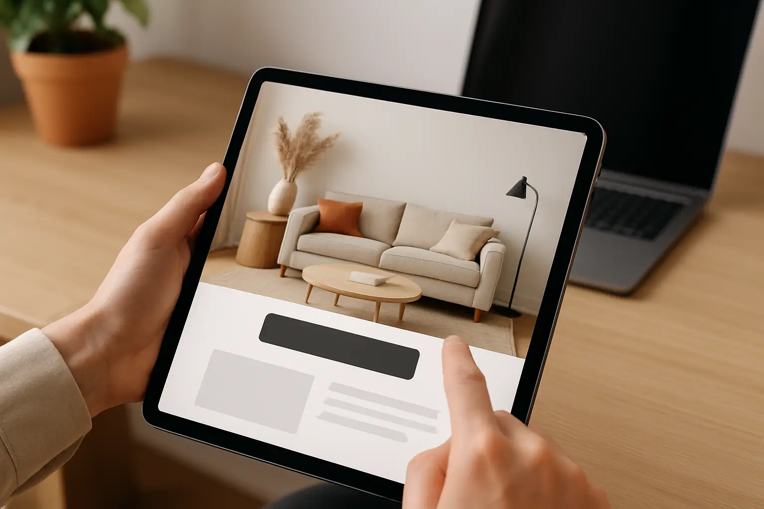
The hero section: one image, one message, one action
The top of the page should behave like a handshake. Keep it clean.
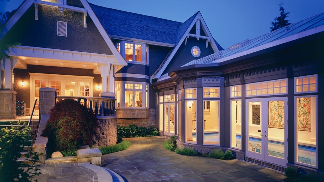
Choose one hero image that matches your core audience and your typical results. If you mostly help families, show a beautiful room that still reads “livable,” not a no-touch showroom. If you’re targeting renters, show smart, non-permanent upgrades. If you’re content-driven, show a styled space that hints at breadth – lighting, color, furniture placement – not a tight crop of a vase.
Pair the image with a headline that repeats your one-line promise in human language. Then add a single primary call to action. For most interior decoration welcome pages, these primary CTAs work best:
- “See decorating ideas by room” (great for content hubs)
- “Take the style quiz” (great for personalization)
- “Book a consult” or “Request a quote” (great for services)
- “Download the starter checklist” (great for list-building)
One primary action doesn’t mean you can’t offer a secondary link. It means you’re not asking people to choose between eight equally loud buttons.
Build trust fast: proof, not paragraphs
Interior decoration is a high-trust category because taste is personal and outcomes are visible. Visitors need reassurance quickly, especially if they don’t know you.
Instead of writing a long “about” section up top, use compact proof:
- A short “As seen in” strip only if it’s real and recognizable
- A before-and-after slider if you have one strong transformation
- A tiny results statement (“Hundreds of room plans delivered” or “New posts weekly”) if you’re a media brand
- Two or three micro-testimonials that mention a specific win (comfort, layout clarity, faster decisions)
Keep it honest. If you’re newer, lean on process proof: a clear method, transparent pricing, and realistic timelines. People trust specificity more than hype.
Make navigation feel like a guided tour
A welcome page works best when it routes different visitor types without making them work.
Use three to five “tiles” or sections that act like clear doors. The trick is to name them based on what the visitor wants, not what you want to publish.
For a media brand or blog, these doors might be “Start with your room,” “Pick a style,” “Fix common layout problems,” and “Shop your home first.” For a decorator or studio, it might be “See my work,” “How the process works,” “Packages and pricing,” and “Contact.”
If you can only pick three, prioritize: (1) inspiration by room, (2) your signature style or approach, and (3) the fastest way to get help.
The content that converts: solve one real problem per section
A welcome page shouldn’t be a gallery. It should be a problem-solver.
A simple way to do this is to create short sections that each answer one common decorating question:
“I don’t know my style”
Give them a quick on-ramp: a short style roundup (modern organic, Scandinavian, coastal, modern farmhouse, minimalist) with one sentence on how each feels and who it suits. Link out to deeper guides.
“My room feels off, but I can’t tell why”
Offer a mini-check: lighting layers, rug size, furniture spacing, and color balance. Even a few lines here can create instant credibility because it shows you understand the real friction points.
“I want it nicer without spending a fortune”
Highlight budget-smart moves: paint, hardware, lighting swaps, and textiles. If you’re selling services, position these as “quick wins” that complement bigger plans. If you’re content-led, point to tutorials.
Each section should end with a clear next click. The conversion isn’t always a purchase. Sometimes it’s getting them to the right room category or to a planning tool.
Design details that matter more than trendy aesthetics
You can absolutely make the page beautiful, but a few practical choices do more work than a trendy font ever will.
First, prioritize scannability. Use short paragraphs, strong subheads, and generous spacing. Most visitors are scanning for relevance.
Second, keep color and type aligned to your promise. If you’re about calm, livable interiors, high-contrast neon accents will feel like a mismatch. If you’re about bold maximalism, a timid palette might undercut your authority.
Third, show at least one “whole room” image. Detail shots are great for texture, but people make decisions based on the big picture: layout, light, and mood.
Finally, optimize for mobile. Many decorating visitors are browsing while standing in their own room. If the buttons are tiny or the text runs long, you lose them right when motivation is highest.
Personalization: when it helps and when it’s overkill
Personalization can be a powerhouse on an interior decoration welcome page, but only if it reduces choices.
A simple style quiz or “choose your room” selector is helpful because it narrows the path quickly. A complex multi-step wizard can backfire if it feels like homework.
If you’re just starting, basic personalization is enough: “Renters start here,” “New homeowners start here,” “Small spaces start here.” That’s not fancy tech, but it mirrors how people self-identify – and that’s what drives clicks.
If you are ready for tech-forward content, you can mention AI room planning or 3D layout tools as a pathway, but keep the promise grounded: faster visualization, fewer costly mistakes, clearer decisions.
Common welcome page mistakes (and what to do instead)
The most common mistake is trying to impress instead of trying to guide. Visitors don’t need to be dazzled; they need to be oriented.
Another frequent issue is leading with generic statements like “We love beautiful spaces.” No one disagrees with that, so it doesn’t differentiate you. Replace it with a specific approach: “Warm minimalism with practical storage,” or “Layered lighting plans that make evenings feel better.”
Finally, many pages hide the action. If someone is ready to book, subscribe, or browse room ideas, that option should be visible without scrolling forever. Put one clear CTA near the top, then repeat it naturally after a few value sections.
A simple blueprint you can implement in an afternoon
If you want a clean structure that fits most brands, build your interior decoration welcome page in this order: hero promise and CTA, quick trust proof, guided navigation doors, three problem-solving sections, then a final CTA.
That’s it. You can refine the visuals over time, but this structure keeps you focused on what converts: clarity, relevance, and momentum.
If you want examples of room-by-room organization and trend-forward pathways that still feel practical, you can see how a content hub like Home Design United structures decorating ideas to help readers self-select quickly.
A welcome page should feel like walking into a well-designed entryway: not crowded, not confusing, and immediately reassuring that you’re in the right place. Make it easy for someone to take one small step forward, and they’ll keep going.