A visitor lands on your site, stares at your hero image for two seconds, and clicks back because they can’t tell if you offer small-space tips, luxury living rooms, or DIY renovations on a budget. That’s not a traffic problem – it’s a welcome page problem.
An interior decoration welcome page is your chance to do what great rooms do: set the mood fast, guide people where they want to go, and make them feel confident they’re in the right place. Done well, it builds trust in seconds and makes your content easier to browse, save, and share.
What an interior decoration welcome page should do (and what it shouldn’t)
A welcome page isn’t a portfolio, a sales page, or a “blog” index that dumps every post in reverse chronological order. It’s a high-intent starting line. Your job is to help a new visitor answer three questions quickly: What style do you cover, what problems do you solve, and where do I begin?
The trade-off is real: the more you try to showcase everything, the less clear your site feels. The best welcome pages choose clarity over completeness. You can still feature variety, but it needs to be organized around how real people browse design content – by room, goal, and style.
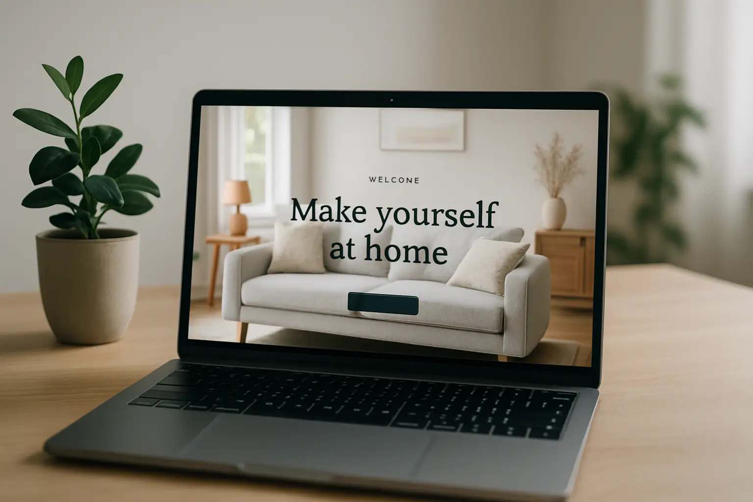
Start with a visual that signals your point of view
Your first screen should feel like walking into a well-designed entryway: inviting, curated, and unmistakably “you.” That doesn’t mean expensive photography or a mansion shot that alienates renters. It means a clean image (or slider used sparingly) that reflects the kind of homes your audience actually lives in.
If your brand leans modern and tech-forward, show a crisp space with layered lighting and a smart, edited palette. If you’re more cozy and family-focused, show texture, warmth, and livability. The visual sets expectations – and expectations drive whether someone stays.
One common mistake is choosing a trendy image that doesn’t match the content. If your site is heavy on DIY and budget makeovers, a perfectly staged showroom living room can create friction. Visitors might think, “This isn’t for me,” even when your advice is.
Write a headline that says who you help, not what you are
“Welcome to my interior design blog” wastes prime real estate. People don’t land on a welcome page because they want a greeting. They want direction.
A stronger headline focuses on outcomes and confidence. Think along the lines of helping visitors decorate smarter, plan a room faster, or choose finishes without regret. You’re not trying to be poetic here – you’re trying to be instantly useful.
Right below the headline, add one short supporting line that clarifies your lane: renters, first-time homeowners, small spaces, family homes, or renovation planning. If you speak to everyone, you’ll sound like you speak to no one.
Build the page around how people actually shop for ideas
Most readers don’t browse décor content like a library. They browse like they’re walking through a home store: “Show me living rooms.” “I need lighting ideas.” “What color should my kitchen be?”
Use clear category paths (Rooms, Style, Projects)
For an interior decoration welcome page, three browsing paths usually cover the majority of intent: rooms, styles, and projects. Rooms capture urgent needs (living room layout, bathroom updates). Styles capture aspiration (modern farmhouse, coastal, minimalist). Projects capture action (paint, lighting swap, shelving, renter-friendly upgrades).
It depends on your audience which path should be first. If you serve DIY renovators, projects may deserve top billing. If your readers are style-led Pinterest savers, style browsing should be more prominent.
Feature “start here” content that reduces overwhelm
New readers need a simple on-ramp. A “Start Here” section works best when it’s not generic. Instead of listing your five newest posts, spotlight foundational guides that prevent expensive mistakes: how to choose a color palette, how to measure for furniture, how to layer lighting, how to mix textures, how to create a floor plan.
This section is where you quietly communicate expertise. You’re telling visitors, “You don’t have to be a designer to make good decisions. Here’s the path.”
Add a quick style quiz – but only if it’s truly helpful
Style quizzes can be shareable and sticky, but they can also feel like fluff if they don’t lead somewhere concrete. If you include one, make sure the result points to a real landing page or curated collection (for example: “Warm Minimalist Bedroom Ideas” with color suggestions, lighting tips, and shopping guidance).
If you don’t have the infrastructure for that yet, skip the quiz and build stronger collections first. A high-performing welcome page is less about gimmicks and more about reducing friction.
Use “collections” to make your content feel curated, not chaotic
A welcome page becomes dramatically more effective when it highlights collections instead of individual posts. Collections are themed groupings that feel like mini-guides: “Small Living Rooms That Don’t Feel Small,” “Rental-Friendly Wall Ideas,” “Lighting Upgrades Under $200,” or “2026 Kitchen Hardware Trends.”
Collections do two things at once. They increase pages per session (because people keep clicking) and they communicate taste (because you’re curating, not just publishing).
This is also where you can balance evergreen and timely content. If you cover seasonal styling or trend forecasting, give it a dedicated, tidy space. Visitors who want what’s new can find it without it swallowing the entire page.
Make your calls-to-action feel like design help, not marketing
Your buttons and links should sound like the next step in a room plan. “Explore living rooms” beats “Read more.” “Get lighting ideas” beats “Click here.”
Keep the number of primary calls-to-action limited. If every section shouts, nothing stands out. Choose one primary action for brand-new visitors (like “Browse by Room”) and one for returning readers (like “See the latest posts”).
If you collect emails, tie the opt-in to a real benefit. A simple example is a room-planning checklist, a paint selection guide, or a lighting cheat sheet. The more practical it is, the more it fits the mindset of someone decorating their home.
Don’t hide your credibility – show it in a human way
If you’ve been featured, have a strong community, or publish consistent how-to content, your welcome page should signal that without turning into a trophy shelf.
One short credibility line can work: how many readers you help each month, what your specialty is, or what kind of guidance you publish (step-by-step, budget-conscious, trend-aware). If you have a team, mention it briefly. If you’re solo, that’s fine too – the key is to sound steady and reliable.
If you run a design content hub like Home Design United, that credibility can also come from structure: clear categories, organized archives, and guides that make decorating decisions simpler.
Design the welcome page like a room: hierarchy first
A beautiful welcome page that’s hard to scan is like a gorgeous living room with no walking path. The layout should have clear hierarchy: big idea first, then navigation, then curated content, then secondary details.
A practical structure often looks like this:
- First screen: image, headline, and one primary action
- Next: browse by room and browse by style
- Then: featured collections and “start here” guides
- After that: latest posts (a smaller section, not the main event)
- Footer area: email opt-in, about link, and social proof
You don’t need every part, but the order matters. Put high-intent browsing tools above the fold. Put “latest posts” lower, where it supports regular readers without confusing new ones.
Mobile matters more than you think
Most home décor browsing happens on phones while people are in a store aisle, on a couch, or standing in their own kitchen wondering what to do next. If your welcome page is heavy, slow, or filled with tiny text overlays, you’ll lose them.
Check your page on mobile and look for three issues: buttons that are too small, sections that feel endless, and images that take forever to load. It’s better to show fewer, stronger visuals than to stack ten mediocre ones.
Common welcome page mistakes that quietly drain engagement
A few patterns show up again and again. The first is being too broad: “Everything about home design” doesn’t tell a visitor where to start. The second is being too trendy: chasing aesthetics without offering real guidance. The third is clutter: too many widgets, too many categories, too many competing calls-to-action.
There’s also an “it depends” reality with personalization. If your audience is mostly renters, you’ll want more renter-friendly pathways and fewer renovation-heavy features. If your audience includes investors or property managers, your welcome page should make it easy to find durable, cost-smart upgrades and turnover-friendly ideas.
A quick test: would a stranger know where to click in 5 seconds?
Open your interior decoration welcome page and pretend you’ve never seen it before. Ask yourself: can I immediately tell what this site helps me do? Do I see a clear route to my room or problem? Do I feel like the advice will be realistic for my home and budget?
If the answer is “kind of,” your welcome page isn’t failing – it’s just not focused yet. Tighten the headline, reduce the options, and turn more of your content into curated collections. That’s when your welcome page stops being a greeting and starts being a guide.
If you want your site to feel like a well-designed home, treat the welcome page like the entryway: simple, intentional, and designed around how people move. When visitors feel oriented and inspired at the same time, they don’t just stay longer – they come back when they’re ready to make the next decision.