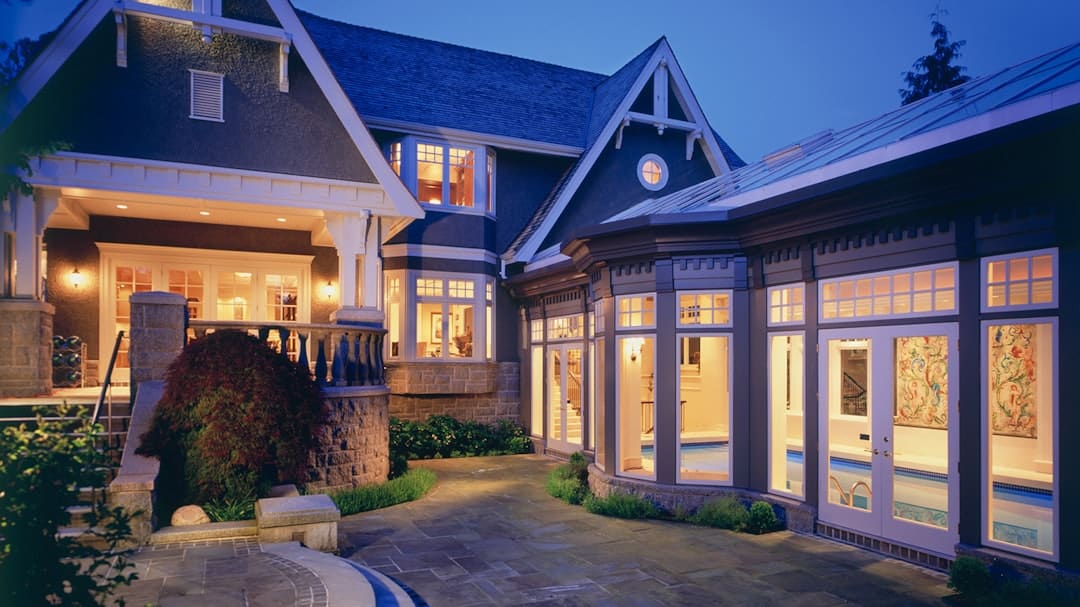
You know the feeling: you finally have a free Saturday to “fix the room,” you move the sofa, and somehow the space feels worse. The TV is too far, the walkway is awkward, and that chair you love is suddenly blocking everything. The problem usually is not your taste – it’s that the layout wasn’t planned around how you actually live.
If you’ve been searching for how to plan a room layout, the goal is simple: create a space that looks intentional and functions effortlessly on a normal Tuesday, not just in photos. Below is a practical, designer-style process you can use for living rooms, bedrooms, home offices, and open-concept spaces.
Start with the room’s real job (not the Pinterest version)
Before you measure anything, decide what the room must do well. A living room might be for family movie nights, adult conversation, kids’ playtime, or all three. A bedroom might need a calm sleep zone plus a vanity or a work-from-home corner.
Be honest about the “non-negotiables.” If you always eat on the couch, you need a place for drinks and remote controls within arm’s reach. If your dog races through the house, you need a clear path that doesn’t send lamps flying. A layout works when it supports habits you already have or habits you’re realistically going to build.
If a room has multiple jobs, prioritize them. You can absolutely do a living room plus office, or a bedroom plus workout space, but you’ll make better choices when you decide what gets the best real estate.
Measure first, then design (yes, even if it’s boring)
Most layout frustration comes from guessing. Take 10 minutes and you’ll save hours of furniture shuffling.
Measure the overall room length and width, then measure anything that interrupts the plan: doorways, window widths, radiator depth, fireplace surround, built-ins, and ceiling height if you’re considering tall storage.
Next, mark where the room “can’t change”: outlets, cable jacks, floor vents, and switches. These details affect where you can realistically place a TV, lamps, desks, and chargers. If you’re renting, outlets often dictate the best layout more than style does.
A trade-off to expect: the most symmetrical layout is not always the most functional. Don’t force perfect balance if it makes daily use harder.
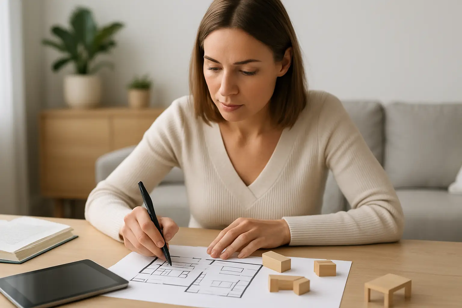
Make a quick floor plan you can actually move around
You don’t need professional drawings. A simple sketch on graph paper works, but a drag-and-drop plan is faster for experimenting. If you like using tools, a basic 3D room planning app can help you catch scale problems early, especially in open layouts.
Keep your plan accurate. One common mistake is drawing a room to scale but then “winging it” on furniture dimensions. Measure your actual pieces (or look up dimensions if you’re shopping), including bulky arms, recliner clearance, and how far dining chairs pull out.
If you want more room-by-room planning frameworks, you can browse Home Design United once you have your measurements and wish list.
How to plan a room layout by zoning the space
Think like a hotel designer: even one room can have clear zones. Zoning is what makes an open space feel calm instead of chaotic.
Start by identifying your primary zone. In a living room, that’s usually seating. In a bedroom, it’s the bed. In a home office, it’s the desk. Place that first, because everything else supports it.
Then layer in secondary zones: reading chair, play corner, homework spot, music area, entry drop zone, or small dining spot. You can define zones without walls by using a rug, a console table behind a sofa, a floor lamp that “claims” a corner, or a bookcase that acts like a soft divider.
A key nuance: zoning is about behavior, not furniture. If the room’s secondary “zone” never gets used, it’s taking space away from what matters.
Protect the traffic flow like it’s a design feature
Traffic flow is the invisible layout element that makes a home feel expensive – because it makes it feel easy.
As a rule of thumb, you want comfortable walking paths that don’t require side-stepping around corners. Many designers aim for about 30-36 inches for main walkways when possible, but older homes and apartments may not allow that everywhere. In tighter rooms, the goal is simply “no obstacle course.”
Pay special attention to these pinch points:
- The path from doorways into the room
- The route to windows and closets (especially in bedrooms)
- The line between the seating area and the TV or fireplace
- The space around dining chairs when pulled out
If you have kids or pets, prioritize the “runway” paths. If you entertain, prioritize a clear route between seating and the kitchen or bar area. This is where layout becomes personal.
Anchor placement: pick the focal point, then commit
Most rooms behave better when they have one clear anchor. It might be a fireplace, a TV wall, a large window, a statement headboard, or even a piece of art you love.
The trick is not just choosing the focal point – it’s resisting the urge to compete with it. If the TV is the focal point, don’t also try to make a gallery wall the loudest element on the same plane. If the fireplace is the focal point, arrange seating to acknowledge it, even if the TV has to move to a side wall.
In multi-use rooms, you can have a “visual focal point” (like a fireplace) and a “functional focal point” (like the TV). That can work, but it usually requires tighter editing elsewhere so the room doesn’t feel like it’s pulling in two directions.
Place the biggest pieces first (and stop forcing them against walls)
Here’s one of the fastest ways to elevate a space: place furniture based on conversation and comfort, not on the instinct to push everything to the perimeter.
In living rooms, start with the sofa and the main chairs. Float the sofa if it improves flow or zoning. Use a console table behind it if you need a landing spot for lighting or decor.
In bedrooms, start with the bed and nightstands. Make sure you can walk comfortably on both sides if it’s a shared room. If it’s a small bedroom, you may decide one side has less clearance – but do it intentionally, and balance it with good lighting and wall-mounted solutions.
In dining areas, size the table to the room you have, not the table you wish you had. A slightly smaller table that allows chairs to slide out easily will get used more often and feel better every day.
Get the “comfort distances” right
This is where layouts go from decent to dialed-in.
For living rooms, the coffee table should be close enough to reach without leaning forward like you’re doing sit-ups. Many people land around 14-18 inches from the sofa, but if you have long legs or a tight space, adjust.
For TV viewing, ideal distance depends on screen size, but the practical approach is simpler: sit where you plan to sit and confirm the screen feels comfortable, not like you’re craning your neck or squinting. If wall-mounting, center the screen roughly at seated eye level rather than high like a sports bar.
For bedrooms, leave enough space to open drawers and closet doors without a furniture collision. If you’re choosing between a larger dresser and better clearance, clearance usually wins – it makes the room feel calmer and easier.
Use rugs and lighting to “lock in” the layout
Once furniture is placed, rugs and lighting are what make it feel finished rather than temporary.
A rug should typically be large enough that at least the front legs of major seating pieces sit on it. A too-small rug makes furniture look like it’s hovering and can shrink the room visually.
Lighting should be layered. Overhead lighting handles general brightness, but you’ll want task lighting (reading lamps, desk lamps) and softer ambient light (floor lamp in a corner, table lamp on a console) to make the room feel welcoming at night. If your layout only works when it’s bright outside, it’s not done yet.
Common layout mistakes that waste space
A few problems show up again and again:
One is undersizing furniture. Small pieces can make a room feel scattered, like you’re furnishing a waiting room. If your room can handle a larger rug or a fuller sofa, it often looks more pulled together.
Another is blocking natural pathways with “pretty” furniture. That accent chair might look perfect in the corner, but if it clips the walkway, you’ll resent it.
Finally, a lot of rooms fail because there’s no real landing zone. People need a place to set a drink, drop keys, charge a phone, or toss a throw blanket. When the layout doesn’t provide that, clutter takes over.
A quick reality check before you commit
Before you declare victory, do a final walk-through. Open every door and drawer. Sit in the main seats. Pretend you’re carrying laundry through the room. Imagine guests entering and looking for a place to sit and set a drink.
If something feels off, it usually comes down to one of three fixes: rotate a piece, swap in a smaller side table, or widen a walkway by a few inches. Layout success is often small adjustments, not a total redo.
The best part is that once you learn how to plan a room layout this way, you stop relying on luck. You start making confident decisions, and your rooms begin to feel like they were designed for you – because they were.
Closing thought: your layout doesn’t have to impress anyone who doesn’t live there. If it supports your routines, reduces daily friction, and makes you want to spend time in the room, you planned it right.