Best Color Combinations for Home Interiors
Choosing the right color combinations for home interiors is one of the most effective ways to transform a space. Colors influence mood, perception, and the overall aesthetic of your home. In 2025, interior designers emphasize creativity, harmony, and personalization, blending timeless palettes with modern trends. Whether you want a cozy, calming atmosphere or a bold, energetic environment, selecting the right color combinations can elevate every room. Understanding color theory, mood, and spatial impact is essential for designing interiors that are both stylish and comfortable.
Understanding Color Theory in Home Design
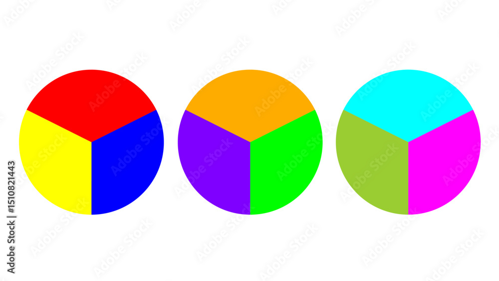
Color theory is the foundation of selecting effective color combinations. The color wheel categorizes colors into primary, secondary, and tertiary groups. Complementary colors, located opposite each other on the wheel, create contrast and vibrancy. Analogous colors, situated next to each other, provide harmony and flow. Triadic combinations, formed by three evenly spaced colors, balance diversity with visual cohesion. By understanding these principles, homeowners can craft interiors that are aesthetically pleasing and psychologically balanced.
Color Combinations
Neutral Color Combinations
Neutral tones are the backbone of versatile interior design. Combinations like beige and white, gray and taupe, or cream and soft brown create calm, sophisticated spaces. Neutrals serve as a backdrop for furniture, artwork, and accent pieces, allowing flexibility in decorating. Layering textures within neutral shades—like linen, wood, or stone—adds depth and visual interest without overwhelming the senses. Neutral palettes are timeless and can adapt to changing trends, making them an ideal choice for long-term design.
Warm Color Palettes
Warm colors like red, orange, yellow, and terracotta create inviting, energetic interiors. Pairing warm tones with neutrals softens intensity while maintaining vibrancy. For example, mustard yellow cushions with beige walls or terracotta accents with soft brown furniture bring warmth without overpowering the space. Warm palettes are particularly effective in living rooms, dining areas, and kitchens, promoting social interaction and comfort. Layering warm tones in varying shades adds depth and richness, enhancing the overall ambiance.
Cool Color Combinations
Cool colors—such as blue, green, and purple—bring tranquility and relaxation to interiors. Light blue and soft gray create serene bedrooms, while mint green with white walls adds freshness to kitchens and bathrooms. Navy blue combined with soft beige or off-white produces elegance and sophistication. Cool palettes are perfect for spaces intended for rest, reflection, or concentration, like bedrooms, home offices, or meditation areas. Combining different shades of cool colors prevents monotony while maintaining a calm atmosphere.
Bold and Vibrant Combinations
For those seeking energetic, dynamic interiors, bold color combinations make a statement. Pairing jewel tones like emerald green, sapphire blue, and ruby red creates a luxurious, dramatic effect. Bold combinations work well as accent walls, statement furniture pieces, or decorative elements, while neutrals balance the intensity. In 2025, designers are exploring rich hues combined with metallic accents, such as gold or bronze, to enhance luxury and depth. Vibrant palettes are ideal for living rooms, entertainment areas, or creative spaces.
Pastel Color Schemes
Pastels bring softness, charm, and sophistication to modern interiors. Soft pinks with mint green, lavender with cream, or baby blue with beige provide a delicate and harmonious look. Pastel combinations are popular in bedrooms, nurseries, and lounges for a calm, airy feel. Layering pastels with natural materials like wood, wicker, or linen enhances texture and warmth. Pastel palettes create a contemporary, stylish look without overwhelming the senses, making them suitable for small and large spaces alike.
Monochromatic Color Combinations
Monochromatic schemes involve using different shades, tints, and tones of a single color. This approach creates a cohesive, elegant, and minimalist aesthetic. For example, varying shades of gray—from charcoal to silver—can produce depth while maintaining visual harmony. Monochromatic blues or greens create soothing, cohesive interiors. Texture and pattern become essential in these schemes, as they prevent the space from feeling flat or monotonous. Monochromatic palettes work well in modern, minimalist, and Scandinavian-inspired interiors.
Earthy Color Palettes
Earth-inspired colors like terracotta, olive green, mustard, and sand connect interiors with nature. Pairing earthy tones with natural materials like wood, stone, and rattan enhances the organic feel. Earthy combinations create warmth, comfort, and balance, making them perfect for living rooms, dining areas, or cozy reading nooks. These palettes are versatile, complementing bohemian, rustic, and modern interior styles while creating a grounded, timeless look.
Black and White Combinations
The classic black-and-white combination remains a staple for elegant, modern interiors. Black adds drama and sophistication, while white provides balance, brightness, and openness. This high-contrast scheme works well in living rooms, kitchens, and bathrooms. Adding a third accent color—like gold, red, or teal—creates visual interest and prevents the space from appearing too stark. Black-and-white combinations suit minimalist, contemporary, and luxury home designs.
Jewel-Tone Accents
Jewel tones like emerald, sapphire, ruby, and amethyst are increasingly popular in 2025 interiors. Using these rich colors as accents against neutral backdrops creates a luxurious and refined aesthetic. Emerald cushions on a cream sofa or sapphire curtains with soft gray walls provide depth and elegance. Jewel tones can be introduced through upholstery, rugs, or decorative items, making it easier to update interiors seasonally without a full redesign.
Mixing Neutrals with Bold Colors
Pairing neutrals with bold accents balances energy and calm. For instance, soft gray walls with bright yellow chairs or beige furniture with navy blue cushions creates dynamic yet harmonious spaces. This approach allows homeowners to experiment with trends while keeping the overall design grounded. Accent colors can be rotated through decor items, enabling a cost-effective way to refresh interiors periodically.
Warm-Neutral Blends
Warm-neutral combinations, such as tan with soft white or cream with light brown, provide cozy, inviting interiors. Layering textures, like wool throws, jute rugs, or wooden furniture, enhances warmth and sophistication. Warm-neutral palettes are versatile and suitable for living rooms, bedrooms, and entryways. They create a sense of comfort and stability while allowing flexibility for additional colors or patterns.
Cool-Neutral Combinations
Cool-neutral palettes—gray with blue, white with soft green, or beige with lavender—offer elegance and calm. These combinations work well in bedrooms, offices, and bathrooms. Incorporating metallic or glass accents adds modernity and visual interest. Cool-neutral schemes provide a relaxing environment while maintaining a contemporary, sophisticated aesthetic that adapts to changing interior trends.
Contrasting Colors
Using contrasting colors effectively creates visual interest and depth. Complementary colors like blue and orange, purple and yellow, or green and red can energize a space. To avoid overwhelming the room, contrast can be applied through accent walls, furniture, or decor items. Proper balance ensures a bold and stylish look that enhances personality and individuality in home interiors.
Soft and Muted Tones
Soft, muted colors—such as dusty pink, sage green, or light gray—create serene and elegant interiors. These shades are ideal for bedrooms, reading areas, and lounges where relaxation is the priority. Soft tones can be layered with patterns, textures, or accent colors to maintain visual interest. In 2025, muted palettes are favored for their timeless appeal and adaptability across various design styles.
Incorporating Metallic Accents
Metallic finishes enhance color combinations by adding luxury and depth. Gold, bronze, silver, and copper accents complement neutral and bold palettes alike. Metallics can be used in lighting fixtures, hardware, frames, or decorative items. Subtle use of metallic tones reflects light and elevates the overall aesthetic without requiring a major redesign.
Trending 2025 Color Combos
In 2025, interior designers favor combinations like sage green with soft beige, navy blue with blush pink, terracotta with cream, and mustard with gray. These pairings balance contemporary trends with timeless appeal. Layering textures, natural materials, and accent pieces enhances these combinations, making spaces feel modern, warm, and inviting. Adopting trending palettes helps achieve a stylish, cohesive look while keeping interiors fresh.
Room-Specific Color Combinations
Different rooms benefit from tailored color combinations. Bedrooms thrive with cool and muted tones like lavender-gray or soft blue-white. Living rooms look welcoming with warm-neutral blends or jewel-tone accents. Kitchens benefit from crisp whites with bold backsplashes or earthy tones with wooden cabinetry. Bathrooms achieve tranquility with pale greens, soft grays, or white-and-blue combinations. Understanding the purpose of each room guides the most effective color choices.
Balancing Color Intensity
Balancing intense colors with softer shades ensures harmony and prevents overwhelming the space. For example, pairing bright red furniture with neutral walls or deep blue curtains with light gray backgrounds creates contrast while maintaining visual balance. Using color in accents, textiles, or decor items allows flexibility and cost-effective updates over time. Proper balance ensures interiors feel cohesive, stylish, and comfortable.
Conclusion
Selecting the best color combinations for home interiors is a strategic process that combines creativity, psychology, and design principles. From timeless neutrals to bold jewel tones, pastels, and earthy palettes, the right combinations transform spaces into stylish, comfortable, and visually appealing environments. Understanding color theory, balancing intensity, layering textures, and choosing room-specific palettes are essential strategies for achieving cohesive interiors. In 2025, the focus is on personalization, harmony, and trend-conscious choices. By thoughtfully combining colors, homeowners can elevate their interiors, enhance mood, and create spaces that reflect style, functionality, and personality.