You can buy the most beautiful tile in the store and still end up with a bathroom that feels… slightly off. Usually it is not the tile. It is the layout.
Layout is the difference between a shower wall that looks crisp and intentional and one that feels busy, choppy, or oddly dated. And the best part is you do not need an interior designer to get it right – you need a plan you can measure, sketch, and stick to.
Bathroom tile layout patterns guide: start with the room, not the tile
Before you fall in love with a pattern on a 2×2 sample board, take a clear look at three things: sightlines, surfaces, and constraints. Sightlines are what you see first when you walk in – usually the vanity wall, the shower back wall, and the floor area in front of the vanity. Those are your “hero” surfaces.
Next, list your surfaces. Floors, shower walls, niche, tub surround, vanity backsplash, and any half walls each read differently. A pattern that looks calming on a floor can feel chaotic when it climbs the walls.
Finally, name the constraints. Drains, toilets, windows, and out-of-plumb corners all influence layout. Tile does not forgive crooked framing, so the smartest layouts are the ones that either correct the optical problem or distract from it.
A quick rule that saves headaches: choose one primary tile layout and one accent moment. When everything is a feature, nothing is.
Step 1: Pick your “anchor line” (the pro move)
Most layout mistakes come from starting in the wrong place. Pros pick an anchor line – a straight reference that keeps the pattern looking balanced in the spots that matter most.
In many bathrooms, the anchor is the centerline of the vanity, the centerline of the shower back wall, or the longest uninterrupted wall. On floors, it is often a line that runs through the doorway so the first view feels symmetrical.
Once you have that anchor, you can dry-lay and adjust so cuts land in less noticeable places – behind the toilet, under the toe-kick, or at the far edge of a tub.
Step 2: Dry-lay on paper to avoid tiny “sliver cuts”
Sliver cuts – those skinny strips of tile at the edges – make even expensive tile look like a rushed DIY. The fix is simple: plan for balanced cuts.
Measure the surface, subtract grout joints (yes, they add up), then see what full tiles you get across. If the math leaves you with a 1-inch strip at one end, shift the layout so you get two larger cuts instead. A bathroom can handle a half tile at each edge. It rarely looks good with a tiny ribbon.
This is also where tile size matters. Large-format tile can minimize grout lines and look high-end, but it is less forgiving in small, out-of-square rooms. Smaller tiles create more visual movement and can “absorb” irregularities, but they demand cleaner alignment because the eye has more lines to track.
The patterns that work best in bathrooms (and when to use them)
Most bathrooms do best with patterns that feel orderly and easy on the eyes. The goal is not to show off a complicated grid – it is to make the space feel bigger, cleaner, and intentional.
Straight stack (grid): modern, calm, and best for big tile
Straight stack means tiles line up in clean rows and columns. It is modern and architectural, and it looks especially sharp with large-format porcelain or a crisp rectangle like 12×24.
Trade-off: this layout highlights crooked walls. If your room is not square, you will see it faster in a strict grid. In older homes, you can still use straight stack, but be ready for extra prep work (flattening walls, careful leveling, and sometimes adjusting where the layout starts).
Running bond (brick/subway): forgiving and classic
Running bond offsets each row, typically by 50 percent. It is the familiar subway look, but it works on floors and walls.
It is forgiving because the stagger breaks up long, continuous lines, so slight variations do not jump out. But a full 50 percent offset on large tiles can create “lippage” (edges that sit higher than adjacent tiles) if the tile is even slightly bowed. Many installers prefer a one-third offset on large-format rectangles for a flatter finish.
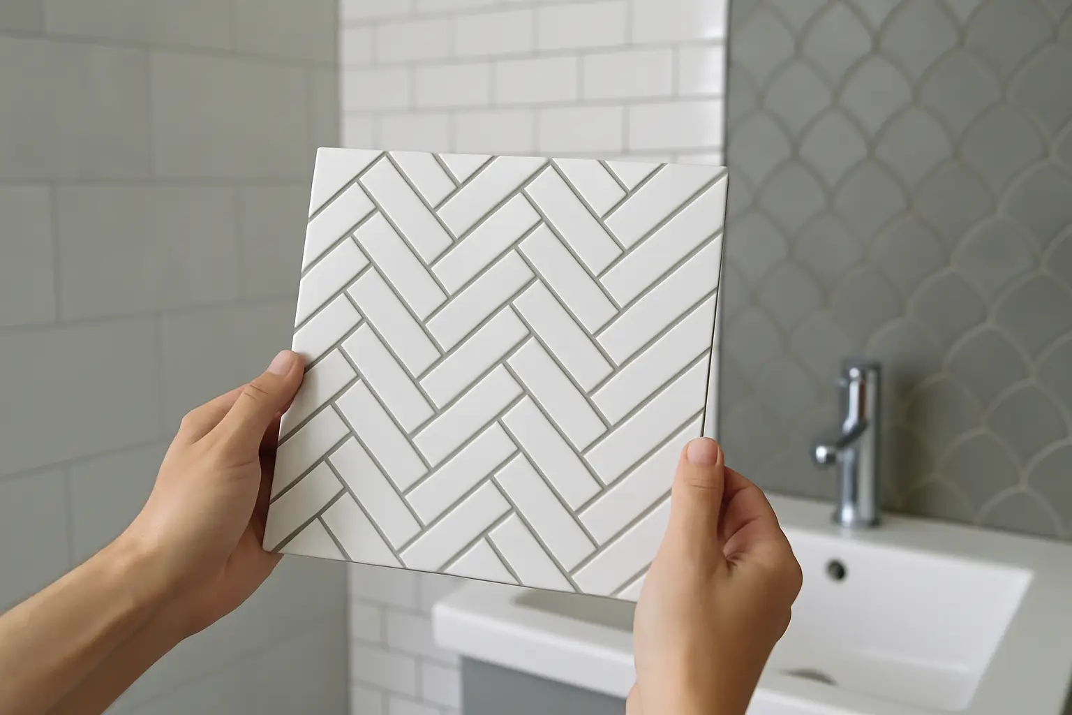
Herringbone: high style in small doses
Herringbone is the pattern people save on Pinterest – and it can be stunning in a bathroom. It adds movement and feels custom.
The key is to use it where it can shine without taking over: a shower back wall, a niche, or a bathroom floor in a powder room. In a large primary bath with multiple planes, herringbone everywhere can feel busy.
Herringbone also magnifies layout errors. If you are DIYing, consider a herringbone mosaic sheet or a smaller area where minor imperfections are less noticeable.
Vertical stack subway: makes ceilings feel taller
If you want a bathroom to feel taller, vertical stack on shower walls is a simple win. It is clean, contemporary, and it pulls the eye up.
This is a great option in standard-height bathrooms where you want a more elevated look without changing the footprint. Pair it with a quiet floor pattern so the room does not feel like it is competing with itself.
Diagonal layout: a classic trick for small floors
Laying square tile on a 45-degree angle can make a small bathroom floor feel larger because the eye reads the longest diagonal line. It is an old-school trick that still works.
Trade-off: it creates more waste and more cutting. If budget is tight, consider a diagonal only in the most visible area (for example, the main floor field) while keeping the shower pan or water closet area simpler.
Checkerboard: bold, graphic, and surprisingly flexible
Checkerboard reads vintage and polished at the same time, especially in black-and-white or warm neutrals. It is a statement, but it is also structured, which helps the room feel organized.
It works best on floors with simple wall tile. If you also want a patterned wall, choose one hero pattern and let the other surfaces be quiet.
Where each pattern performs best: floors vs walls vs shower
Floors need slip resistance and visual stability. Walls can handle more drama because they are not fighting gravity and water underfoot.
On floors, mosaics (like 2×2 or hex) are popular in showers because grout lines add traction and help the tile follow the slope to the drain. Outside the shower, larger tiles feel more seamless and easier to clean, but you will want a finish that is not overly glossy.
On shower walls, large-format tile looks luxurious and reduces grout maintenance. If you love subway tile, consider running it vertically or using a slightly larger size to keep the look fresh.
A niche is a great place for your accent pattern because it is contained and reads like a design detail. If you bring in herringbone or a bold mosaic, keep the niche tile aligned with your main grout lines when possible. That small alignment choice is what makes the whole shower look “designed.”
Grout lines are part of the pattern (treat them that way)
In any bathroom tile layout patterns guide, grout deserves its own moment because grout is not just filler – it is a visual grid.
If you want the pattern to stand out (like herringbone or hex), use a grout color with a bit of contrast. If you want the tile to feel calm and continuous (like marble-look porcelain), choose a grout that blends.
Also: smaller grout joints tend to look more modern, but only if your tile is rectified (very consistent edges). Handmade-look tile often needs a wider joint to look right and to accommodate variation.
Common layout mistakes that make bathrooms feel cheaper
You can avoid most “builder-grade” vibes with a few smart decisions.
First, do not center the floor on the toilet. Center it on the room or the vanity sightline. Second, avoid a skinny cut right at the shower entrance or along the bathtub apron – those edges are in your face every day. Third, do not change tile directions without a reason. A random shift from horizontal to vertical can look like a patch, not a plan.
And if you are mixing tiles, watch the scale. Pairing a tiny mosaic with a very busy veined tile can create visual noise. Usually, one surface should be the calm backdrop.
A simple planning workflow you can actually follow
If you want a repeatable process, this is the order that keeps decisions clean: choose the hero surface and pattern (often the shower back wall or the main floor), then choose the supporting field tile, then pick grout, then choose the accent location (niche, band, or vanity wall). If you decide accents first, the rest of the room tends to become a compromise.
If you like to visualize options quickly, it helps to mock up two or three pattern directions using a basic room sketch or a simple digital floor plan. Even a rough layout can reveal whether a diagonal floor will create awkward cuts at the doorway or whether herringbone will fight your vanity width.
For more planning-first bathroom design ideas and step-by-step renovation guides, Home Design United is a helpful hub to keep your decisions moving in the right order: https://homedesignunited.com/.
The final decision: choose the layout that supports your life
The best tile pattern is not the one that impresses strangers on social media. It is the one that makes your bathroom feel clean, comfortable, and easy to live with every single day. When you pick a strong anchor line, avoid sliver cuts, and keep one surface as the hero, the room starts to feel designed on purpose – and that is what makes it feel like a level-up, no matter your budget.