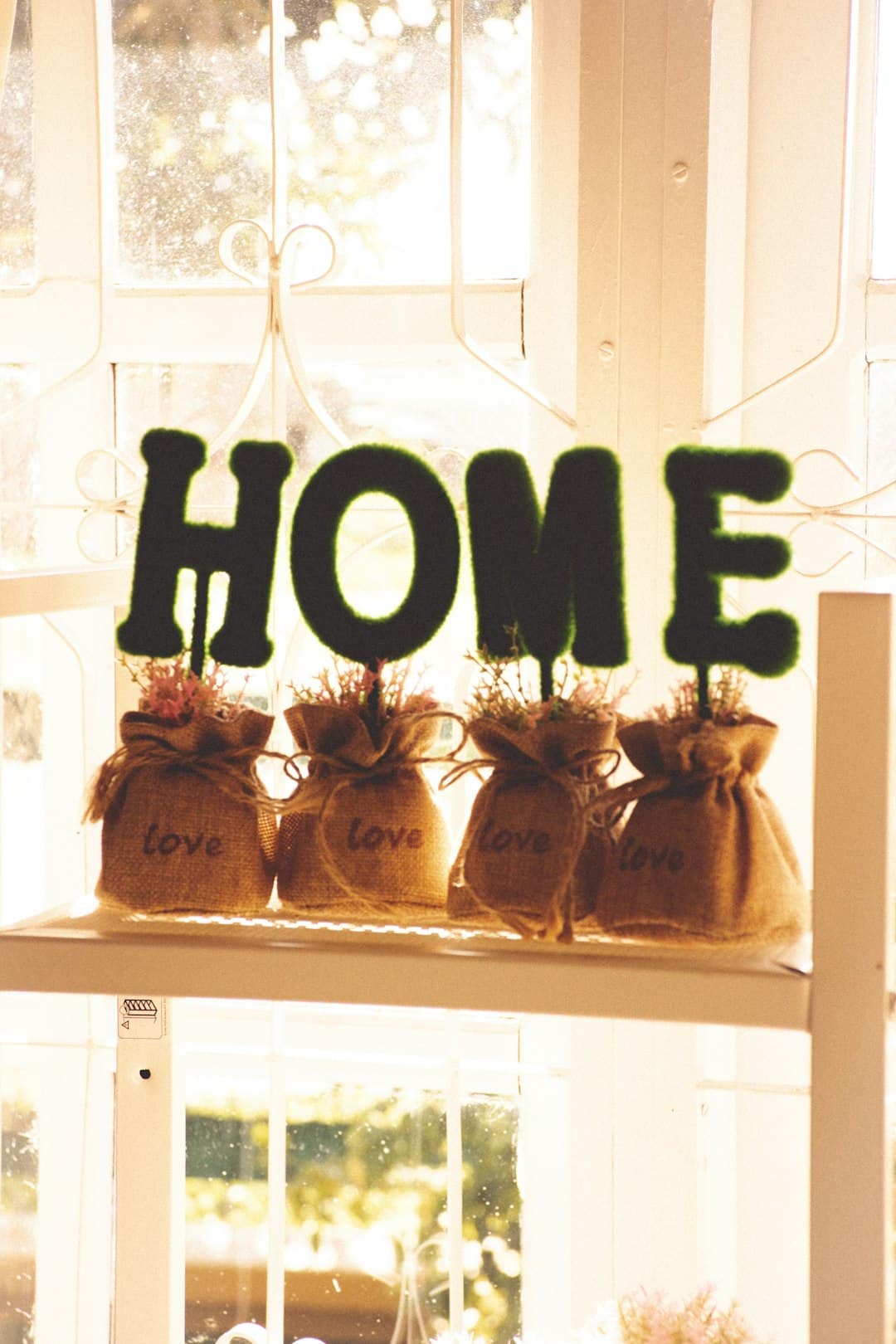
You know the moment: you paint a “safe” neutral, move the furniture back in, and somehow the room still feels off. Not bad, just… unsettled. Nine times out of ten, it’s not the paint color. It’s the palette – the full set of colors and finishes working (or not working) together.
This guide is a practical way to choose a color palette for home that looks intentional across rooms, holds up in real life lighting, and supports how you actually live. It’s not about following rules for the sake of rules. It’s about making decisions you won’t second-guess after the first sunny afternoon or the first night with lamps on.
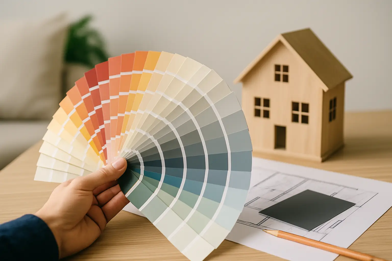
How to choose a color palette for home (the decision framework)
A home palette is less like picking “three colors” and more like setting a system: a base neutral, one or two supporting neutrals, a few accents, and the metals and woods that quietly act like colors too. The goal is continuity without boredom.
Start by deciding what you want your home to feel like, not what you want it to look like on a paint chip. “Calm and warm,” “bright and clean,” “moody and cozy,” and “fresh but grounded” are all valid directions – and they lead to different undertones, contrast levels, and accent choices.
If you’re stuck, walk through your space at the time you’re most often home (morning coffee, evening wind-down). Ask yourself what you want to change: more energy, more softness, less visual clutter, more personality. Your palette should solve that problem.
Step 1: Audit what you can’t (or won’t) change
Before you fall in love with a trendy paint shade, take inventory of the fixed elements that will stay put for a while. These are the anchors your palette has to play nicely with.
Think flooring (warm oak vs gray LVP), countertops (cool marble vs creamy quartz), large tile, brick, and big upholstered pieces you’re keeping. Even a dominant rug counts. If your kitchen has warm wood cabinets and beige stone, forcing icy grays everywhere is an uphill battle.
This is also where renters can win: you might not change the floors, but you can choose a palette that flatters them instead of fighting them.
Step 2: Read your light like a designer
Light changes color. Two rooms with the same paint can look completely different because of window direction, tree cover, and artificial lighting.
North-facing rooms tend to feel cooler and a little flatter, so warm whites, creamy neutrals, and warmer grays often feel more welcoming. South-facing rooms usually handle cooler colors better because they get stronger, warmer daylight. East-facing rooms can look bright and crisp in the morning then dim later, while west-facing rooms can turn warm and intense in the afternoon.
Don’t overthink this, but don’t ignore it. If you’re choosing between two similar neutrals, light direction is often the tie-breaker.
Step 3: Pick your “whole-home” neutral first
If you want your home to feel cohesive, choose one main neutral that can appear in multiple spaces – walls, trim, large textiles, or cabinetry. This doesn’t mean everything has to be the same color. It means you have a reliable baseline.
A strong whole-home neutral is usually a white, off-white, greige, or soft taupe that matches your fixed finishes and your light. Pay attention to undertones. A neutral that looks “clean” on a card can pull pink, green, or yellow on the wall depending on what’s around it.
A helpful mindset: choose the neutral that makes your floors and major wood tones look expensive. When the neutral is right, the room feels calm even before you add decor.
Step 4: Choose a second neutral for depth
Most homes look better with at least two neutrals. Your second neutral is what adds shape and contrast without shouting.
If your main neutral is a warm white, your second neutral might be a soft camel, warm gray, or mushroom tone for upholstery or drapery. If your main neutral is a light greige, your second neutral might be a deeper greige or a charcoal used sparingly.
This is also where you decide your contrast level. High-contrast homes (white walls, black accents) feel crisp and modern but can feel stark if your light is cool. Low-contrast homes (creams, beiges, soft browns) feel relaxing but need texture to avoid looking flat.
Step 5: Add 1-2 accent colors that fit your lifestyle
Accent colors are where personality shows up, but they also have the biggest chance of regret. The trick is to choose accents that you can repeat in small ways across rooms – and that you won’t hate when you see them daily.
A good accent color strategy is to pick one “primary accent” and one “supporting accent.” For example, navy plus warm rust, or sage plus soft black, or dusty blue plus sand. You don’t have to use them everywhere, but you should be able to echo them: a pillow here, art there, a vase on a shelf.
If you have an open concept main floor, keep accents more controlled and use them in layers. In closed-off rooms like bedrooms or a powder bath, you can take bigger swings.
Step 6: Treat metals and wood tones like part of the palette
Hardware, lighting, faucets, and furniture legs create a “metal story.” Wood tones create a “warmth story.” Both matter as much as paint.
You don’t need one metal everywhere, but you do need a plan. A simple approach is to choose a dominant metal (like brushed nickel or warm brass) and a supporting metal (like matte black) that appears in smaller touches. Mixed metals look intentional when each one repeats at least twice in a space.
With wood, aim for harmony, not perfect matching. If everything is the same tone, the room can feel like a set. If every wood is wildly different, it can feel chaotic. A good middle ground is two to three wood tones: one dominant, one supporting, one occasional.
Step 7: Build your palette as a “ratio,” not a list
If you’ve ever wondered why a palette looks great in theory but overwhelming in real life, it’s usually a ratio problem. Most spaces feel best when the base neutral does the heavy lifting, the second neutral adds dimension, and accents are the final layer.
A practical ratio to aim for is roughly 70% base neutral, 20% secondary neutral, and 10% accents. You can bend that depending on your style – maximalists will push the accent percentage, minimalists will pull it back – but the idea holds: accents should accent.
Room-by-room: keep it cohesive without making it boring
A whole-home palette works when the “through line” is consistent, but each room gets its own moment.
In hallways and connecting spaces, keep it simple. These areas act like visual transitions. Using your whole-home neutral here makes the entire house feel more polished.
In living rooms, it helps to anchor with a neutral sofa or a neutral rug (not both, unless you love ultra-calm). Then bring in your accent colors through pillows, throws, art, and one statement piece like an accent chair.
In kitchens, let fixed finishes lead. If you’re not remodeling, your palette might be built around cabinets and counters, with paint and hardware as supporting players. If you are remodeling, decide early whether your kitchen is warm-leaning (creamy whites, warm woods, brass) or cool-leaning (crisper whites, cooler stones, nickel). Mixing warm and cool can look amazing, but it’s harder to pull off without testing.
In bedrooms, most people sleep better in lower-contrast palettes with softer accents. That doesn’t mean bland. Deep, muted colors (navy, forest, charcoal, clay) can feel incredibly restful when balanced with warm neutrals and cozy texture.
In bathrooms, color is often about materials: tile, vanity, and metal finishes. If you want to experiment, powder rooms are your best playground. A bolder accent color or wallpaper-like pattern can feel fun because you don’t live in it all day.
Testing: the part that saves you money
If there’s one habit that separates confident DIY decorators from frustrated repainters, it’s testing colors in the actual room.
Paint chips are a start, but they’re not enough. Sample your top contenders and view them in morning light, afternoon light, and evening lamp light. Also hold them next to your flooring and major textiles.
If you want to move faster, use a simple “digital mockup” workflow: take a straight-on photo of the room, then use a basic paint-visualizer app or an AI image editor to preview a few directions. It won’t be perfect, but it will reveal whether your idea is calm, high-contrast, warm, cool, or too intense. For more planning tools and room-by-room guidance, Home Design United keeps practical design decision-making front and center.
Common palette mistakes (and how to avoid them)
The most common mistake is choosing colors in isolation. A paint color that looks gorgeous alone can look wrong next to a warm floor or a cool countertop. Always compare.
The second mistake is ignoring undertones. Two “grays” can fight because one is blue-based and the other is green-based. Two “whites” can clash because one is creamy and the other is crisp.
Another frequent issue is overusing the accent color. If your accent is strong (teal, red, bright green), keep it to smaller, repeatable pieces unless you’re intentionally creating a bold statement room.
Finally, many homes feel unfinished because the palette stops at paint. If your walls are great but your lighting is too cool, your metals are random, and your textiles don’t repeat any color, the room won’t feel pulled together. The fix is usually simple: warmer bulbs, a more consistent metal story, and repeating your accent color in two or three places.
A closing thought you can use today
If you’re torn between “playing it safe” and choosing something that feels like you, let your home’s palette be calm first, personal second. Choose a neutral foundation that flatters your light and finishes, then add personality in layers you can swap as your style evolves. That’s how a home stays both timeless and yours.